Common Configuration
In the Design Style Configuration dialog, there are three sections under Common Configuration:
-
Component Styling
-
Option Toggles
-
Symbol Order
Component Styling
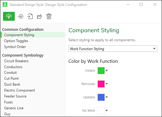
Do you want to color-code your components by Work Function? In other words, do you want a certain color for Install, a different color for Remove, another color for Update, etc.? Component Styling is the solution.
In the Design Style Configuration dialog > Component Styling, use the drop-down to choose Work Function Styling. Then, choose your desired colors.
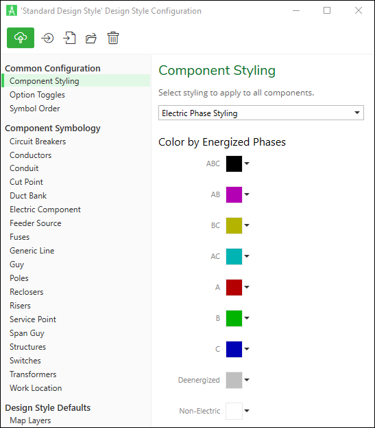
For electric customers, Electric Phase Styling is also available.
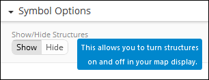
Option Toggles
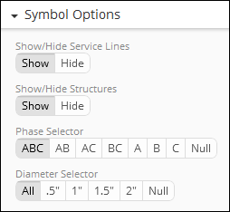
Option Toggles give users the ability to turn components on or off in their map display. For example:
When configuring, keep the following in mind:
-
Option Toggles are saved within a Design Style.
-
An Option Toggle is a true toggle, meaning users are able to have one, and only one, option toggled on.
-
The “on/off” state of a toggle is applied per Design Style, per map. Further, values persist with the design. This means users can not only save their toggles, but they can save them differently with specific maps on the Layout tab.
-
We recommend having standard symbols verified and working before moving on to Option Toggles. Depending on the complexity of your symbols, it is likely easier to incorporate the toggle toward the end of designing symbology.
Configuring Option Toggles is a two-step process:
-
First, you create the toggle and “declare” its values. For example, you can declare “Show” and “Hide” as the two values in a toggle.
-
Second, those values are then inserted into the components’ attribute table. This allows you to incorporate them into the components’ symbology to determine what happens when a user interacts with the toggle. For example, if the user “Shows” a component, then typically you have that action connected to the Symbol Key that displays the component. If the user “Hides” a component, then you have that action connected to a null symbol, which essentially hides it on the map.
To configure an Option Toggle, follow these steps:
-
If necessary, on the Maps tab > Design subtab, click the Options button to the right of the Design Style, then choose Configure Style.
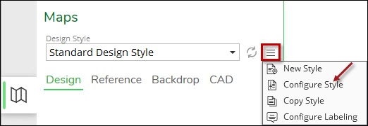
-
In the Design Style Configuration dialog, under Common Configuration click Option Toggles.
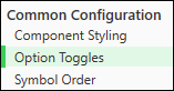
-
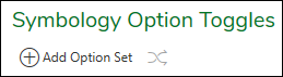
Under Symbology Option Toggles, click “Add Option Set.”
-
In the Option Set dialog, provide the following information:
-
Name: Type a clear and concise name. This is visible to end users and administrators.
-
Description: Type a helpful description. This is visible via a tooltip that appears when the end user hovers over the toggle.
-
Selectable Values: Type the toggle values. These are the names of the toggle buttons that end users click.
-
After typing a Value, click Add to type another.
-
Choose which value should be toggled on by default.
-
Drag and drop to rearrange the values.
-
For example, if the Option Set dialog looks like the following...
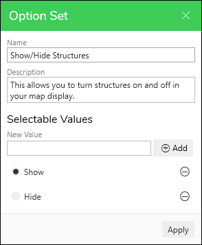
...it produces a toggle that looks like this:
-
-
When finished, click Apply to close the Option Set dialog.
NOTE: If you have multiple Option Toggles, you can re-arrange their top-to-bottom order. Click the Adjust Order tool. This opens an Adjust Options Order dialog where you can drag
and drop them into a desired order.
tool. This opens an Adjust Options Order dialog where you can drag
and drop them into a desired order. -
Click the Apply Preview
 button. Notice your toggle appears on the Maps pane.
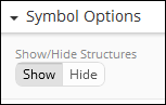
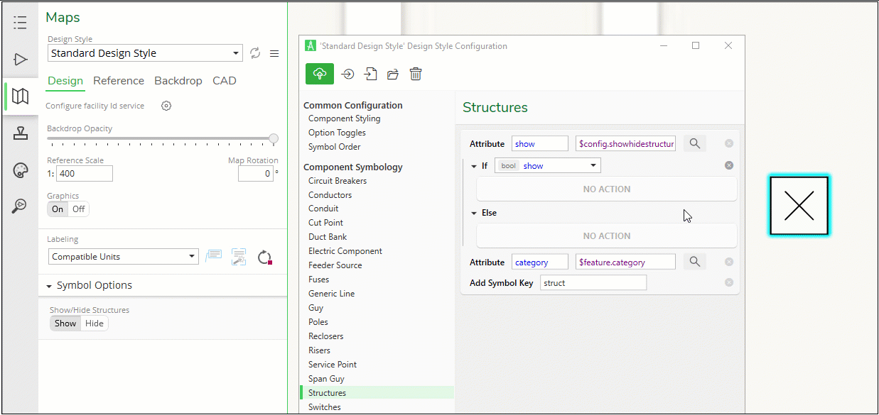
The toggle is present, but it does not work just yet. Now that you have declared the values, you can incorporate them into the Component Symbology. The steps below continue using Structures as an example.
-
In the Design Style Configuration dialog, click the component that should follow the toggle (again, these steps use Structures as an example).
-
Select the same component on the map (you need to select the component in order to view its attributes in an upcoming step).
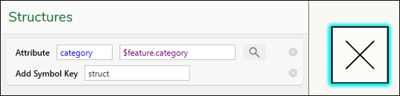 IMPORTANT: As you can see in the image above, the Structures already have their Symbol Key configured. As stated above in this topic, we recommend configuring and verifying the symbols first before including Toggle Options.
Now it is time to include the “Show/Hide” logic into the symbology.
-
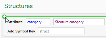
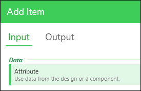
Hover your mouse cursor above the current Attribute, and notice a green add row appears.
-
Click when you see the green add row.
-
In the Add Item dialog > Input, click Attribute, then click Apply.
-
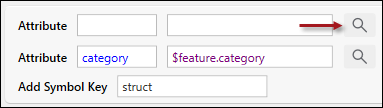
Click the Magnifying Glass icon for the new Attribute.
-
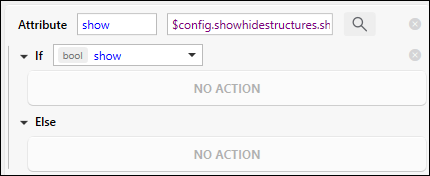
In the Select Attribute dialog, expand the “$config” group until you find the attribute where “show” is the “True” boolean (bool) value.
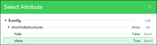 NOTE: These are the values you “declared” earlier in these steps. Coming up, you use an “If Attribute is True, Else...” statement, and that’s why you are grabbing the attribute whose value is “true.”
 -
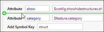
Click the attribute where “show” is the “True” bool value (this is the green row in the image above), then click Apply.
-
Hover your mouse directly beneath the new “show” attribute, then click when you see the green add row.
-
In the Add Item dialog, click Process, then click “If Attribute is True, Else...”
-
Click Apply.
-
Notice the dialog is ready for the toggle logic. In this case, when the toggle is on “Show” (or “True” behind the scenes), you want to display the icon. Otherwise, you do not want to display the icon.
-
Good news, you can drag and drop your current symbology logic under the “If” statement, as seen in the following animated demonstration (click the animation to open it full size in a separate browser tab):
-
As seen in the animated demonstration, after dropping in your logic, click the Apply Preview
button and test your new toggle. -
If you are satisfied with the toggle, click the Save
 icon.
icon.
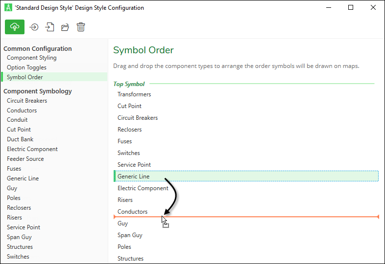
Symbol Order
When the application draws components on the map, it does so in bottom-to-top order. Typically, polygons (features that have an area or footprint) are drawn first on the bottom, followed by lines, and finished with points on top.
You can control the “stack” or “Z” order of symbols in the Design Style Configuration dialog > Symbol Order. Drag and drop the components to the desired bottom-to-top order.