
Style - Label Configuration
When working with labels, the Style subtab controls the look and feel of the label.
 tool with each configuration change in order to see the change
on the map.
tool with each configuration change in order to see the change
on the map.Click the Style subtab to configure the label.
From top to bottom, the label configurations include the following:
Text Style
-
Font: Use the drop-down to choose the label font.
-
Size: Type in a font size.
-
Maximum Line Width (optional): This sets a width for the label, and if the label exceeds the width, the application automatically inserts a line break and moves the extra characters to the next row in the label. The number you type is a relative width that depends on the reference scale. Thus, type a starting number (such as 50), click the Apply Preview
tool, and then adjust up or down.
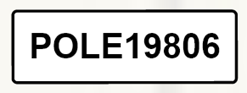
No width:
Width of 50:

-
Text Orientation: Options include auto (default), left, center, and right alignment.
-
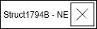
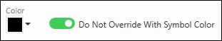
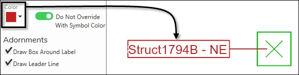
Color: By default, the color of your label matches the color of the component’s symbol. So, if the component is green, then the label is green. If you would prefer the label to be a different color, choose the desired color and toggle the “Do not Override with Symbol Color” on.
-
The color you choose applies to the label, the box (if checked), and the leader line (if checked).
-
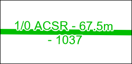
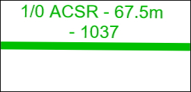
Halo
-
The halo is a small buffer drawn around the label text. It helps prevent the text from bleeding into the background.
With a halo:
Without a halo:
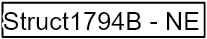
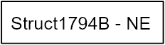
Adornments and Content Padding
-
The “Draw Box Around Label” and the “Content Padding” choices are related to each other. “Padding” provides a buffer between your label text and the box.
-
For example, here is a box with “0” as its horizontal and vertical padding.
-
And, here is a box with “5” as its horizontal and vertical padding.
-
The Corner Radius creates rounded corners if the Draw Box Around Label is checked. For example, here is a box with a corner radius of “2”.
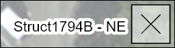
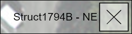
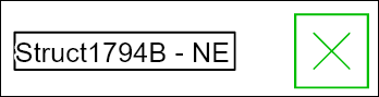
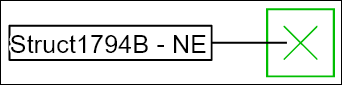
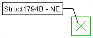
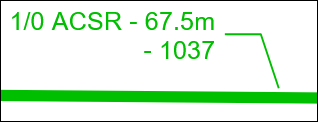
The “Draw Leader Line” choice draws a connecting line between the component and the label.
-
For example, here is no leader line.
-
And, here is a leader line.
-
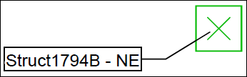
Also, on the Layout tab, if you move a label, the leader line automatically moves too.
-
Label Placement
For Label Placement, the choices differ when working with a line component or a point component.
-
When working with a point component, you have two choices: Center and Offset.
-
Center places the label directly in the middle of the point.
-
Offset allows you to move the label off the point by a predetermined amount. Here, the label is offset -25 horizontally (X) and +25 vertically (Y).
-
-
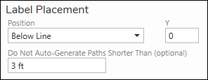
When working with a line component, you have four choices: Inline, Above Line, Below Line, and Offset.
-
Inline places the label directly along the line.
-
Above Line places the label on the top of the line.
-
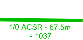
Below Line places the label on the bottom of the line.
-
Offset allows you to move the label off the line by a predetermined amount. Here, the label is offset -25 horizontally (X) and +25 vertically (Y).
-
-
Also, line symbols have an extra configuration called, “Do not Auto-Generate Paths Shorter Than (optional).” This allows you to type in a distance, and any lines shorter than that distance are not labeled. This is helpful to clear cluttered areas of short line sections. You must include a Unit of Measure abbreviation after the number.
 NOTE: If you choose to set this length, you can always override it and place a label personally on the Layout tab. In other words, with this “shorter than” configuration set, the application does not label short lines, but if you really needed to label some short lines, you still can individually on the Layout tab.
 -
Further, with line labels you can set the Repeat Distance. For long, line features, this places the same label multiple times along the line, spaced out by the Repeat Distance. The number you type is a relative distance that depends on the reference scale. Thus, type a starting number (such as 50), click the Apply Preview
tool, and then adjust up or down.
-
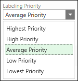
For both point and line labels, you can set the Labeling Priority. This accomplishes two preferences:
-
This determines who “wins” if labels overlap, with higher priority labels placed before lower priority labels.
-
This allows the application to explore farther within the design to find a suitable location for a label. Higher priority labels search a greater area than lower priority labels.
-
You can also check the box to “Skip label instead of overlapping components” to not display a label at all in case of overlap.
-