Create Page Elements
Page Elements are the building blocks of a Page Template. You could start the process by building some Page Templates, but you might appreciate having your Elements ready first. Thus, this set of topics discusses each Element type. The next set of topics discusses putting them all together in a Page Template.
Prerequisite
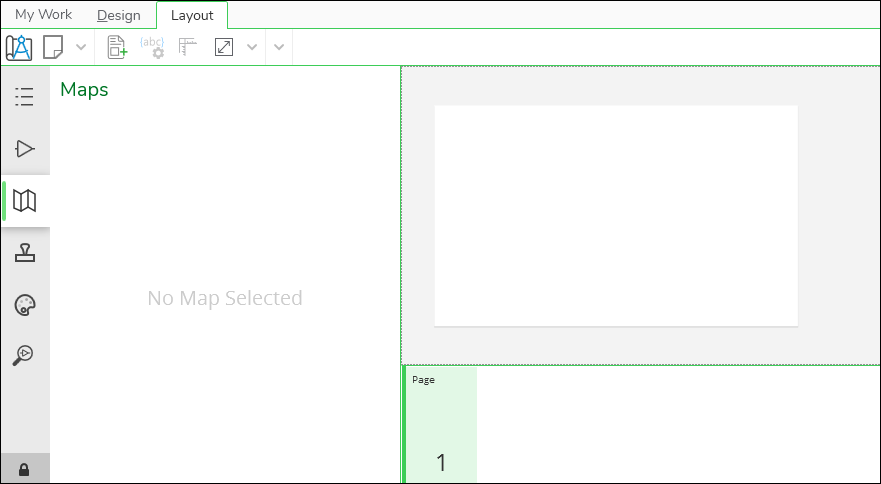
To configure any Page Element, you need a blank page to work on. It is merely a canvas for you as you work with your elements.
To get a blank page:
-
In Designer XI, click the Layout tab at the top of the interface.
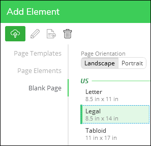
-
In the Add Element dialog, click Blank Page.
-
Choose a page size. While creating Page Elements, pick a typical page size. That way you know the bounds of a final print while creating the Elements.
-
At the bottom of the Add Element dialog, click Add.
-
You now have a canvas to work on as you configure your Page Elements.
Good to Know Before Working with Elements
These are helpful tips, tricks, and shortcuts to know before jumping into Page Elements.
Single-Click to Select an Element
When you single-click an element, it outlines in blue and displays blue handles along the edges and corners.
-
To move an element, click and hold somewhere in the middle of the element, then drag your mouse to the desired position.
-
To re-size an element, click and hold a blue handle, than drag your mouse to the desired size.
-
Maps, Boxes, and Text allow you to re-size to any aspect ratio (also known as the proportion). Their aspect ratios are unlocked by default. Press and hold Shift while re-sizing to temporarily lock their aspect ratios.
-
Pictures are the opposite. By default, they are locked, and when you re-size them, they maintain their aspect ratios. Press and hold Shift while re-sizing to temporarily unlock their aspect ratios.
-
Double-Click to Activate an Element
When you double-click an element, it outlines in orange to indicate it is activated. Activating an element opens up other configurations for that element, such as Design Styles, colors, and fonts.
-
You can activate Maps, Boxes, and Text. You cannot activate Pictures or the North Arrow.
-
To de-activate, double-click somewhere else such as an empty part of the page or the gray area around the page.
Alt+Drag to Copy an Element
After configuring an element, you might want the exact same element somewhere else on the page. With Alt+Drag, you can copy elements.
-
Click the element once to select it.
-
Press and hold the Alt key.
-
Click somewhere in the middle of the element, then drag your mouse.
-
Notice it creates a copy.
-
Position the copy where appropriate.
Use Arrow Keys to Move Elements
Dragging elements around with your mouse gets you pretty close. But when an element is selected, you can press the arrow keys to move it slightly.
-
Shift+Arrow moves the element the most, about .1 in or roughly 2.6 mm per keystroke.
-
Just the arrow moves it .01 in or roughly .25 mm per keystroke.
-
Ctrl+Arrow moves the element the least, 1 pixel per keystroke.
Use the Position Element tool for Precise Placement
To really focus on element position, use the Position Element tool. This allows you to type in exact locations and sizes
for your elements. This helps ensure elements are exactly lined up
in straight rows or columns.
Map Element
The map is typically the “star of the show” when it comes to Layouts.
For the Map Element, you are able to save the size and shape of the map frame. The Map Element always uses the default Design Style, but an end user could change it for their Layout.
Since the size and shape are really the main things to consider for Map Elements, we recommend saving common sizes. To do so, follow these steps:
-
Ensure you have a canvas, as stated in Create Page Elements.
-
In the Add Element dialog, click Page Elements.
IMPORTANT: It is required to click Page Elements first if you intend to create a new Element. If you are on Page Templates, then you would create a new Template. -
In the New Element Type dialog, click Map, then Next.
-
In the Create Element dialog, type a concise and descriptive Name. This Name is seen by end users. This example uses “5 x 5 Map.”
-
Notice the Category field. Categories organize you Elements. The first time you want a Category, you type its name into the field. For subsequent Elements, you can choose the Category name from the drop-down.
-
Type a Category name. This example uses, “Map Sizes.”
-
Type a Description. This is optional, but it allows you to provide a little more detail about the Element for your end users.
-
Click Apply.
-
Notice your Map Element now appears in the Add Element dialog.
-
Click your new Map Element once, then click Add.
-
Notice your Map Element appears in the upper, left-hand corner of your page.
Even though you named the Map Element “5 x 5,” this new Element is not that size. So, you will now change the size and re-save.
-
Click the Map Element once to highlight in blue.
-
Change the Width and Height to the appropriate sizes (in this case, 5 x 5). Press Enter after you change the size to accept it.
-
Select the Map Element again, if necessary. It should still be selected with a blue outline.
-
In the Add Element dialog, click Page Elements.
-
Click your Map Element once to highlight.
-
At the bottom of the Edit Element dialog, click the Copy Select Element Properties
tool.
TIP: What’s happening in this Step? Well, the Map Element you added initially came with the default size. You then changed the size, and now you are updating the existing Element with the new size. -
Click Apply.
-
Repeat this process to create other standard Map Sizes.
Text Element
Whether it is a title, Work Location notes, designer name, print date...a typical Layout is full of different Text Elements.
You can include Text Elements that allow for free-type and Text Elements that draw information from design attributes.
To create Text Elements, follow these steps:
-
Ensure you have a canvas, as stated in Create Page Elements.
-
In the Add Element dialog, click Page Elements.
IMPORTANT: It is required to click Page Elements first if you intend to create a new Element. If you are on Page Templates, then you would create a new Template. -
In the New Element Type dialog, click Text, then Next.
-
In the Create Element dialog, type a concise and descriptive Name. This Name is seen by end users. This example uses “Design Name.”
-
Notice the Category field. Categories organize you Elements. The first time you want a Category, you type its name into the field. For subsequent Elements, you can choose the Category name from the drop-down.
-
Type a Category name. This example uses, “Text Blocks.”
-
Type a Description. This is optional, but it allows you to provide a little more detail about the Element for your end users.
-
Click Apply.
-
Notice your Text Element now appears in the Add Element dialog.
-
Click your new Text Element once, then click Add.
-
Notice your Map Element appears in the middle of your page.
You will now work with the Text Element data source, size, color, and font. First, you establish the source.
-
Double-click the Text Element, and notice it becomes active (outlines in orange).
-
At this point, you can type in the box. In this example, we are going to bring in the design name from the design attributes. But, perhaps you want a little bit of introductory text such as “Design Name:” You can type that in directly within the box.
-
A drop-down appears showing you all the possible attributes you can add to your Text Element.
-
Expand the categories until you find the desired attribute. Again, in this example, we are finding the Design Name.
-
Click Insert. Notice the application added the attribute to the Text Element.
TIP: Are you working with a date or time field? You can add Format Specifiers to change the date or time format. For example:-
Let’s say you are bringing in the current date and time to act as a “Generated On” text element. Notice how the format is saved in the Attributes.
-
Thus, if you left it as the variable alone...
...the final print looks exactly like the attribute:
-
Or, you can add a Format Specifier at the end of the variable to change the final look. After the variable, type a colon followed by the Format Specifier, which is a single letter. Case does matter. Here are some common examples and how they transform the field (the “now” part is just continuing the example above; your variable depends on what attribute you are using):
-
{now:d} generates 7/7/2023
-
{now:g} generates 7/7/2023 9:38 AM
-
{now:m} generates July 7
-
{now:t} generates 9:38 AM
-
{now:y} generates July 2023
-
{now:D} generates Thursday, July 7, 2023
-
-
Those are the most common, but there are more described in the Microsoft help article Standard Date and Time Format Strings.
-
So, if you changed the variable to {$environment.now:d} (notice the :d at the end), it would display as:
-
-
With the Text Element still active, you can work with the font, size, and style tools found on the Layout tab toolbar.
-
When finished, click outside the Text Element. Notice it is outlined in blue with “handles” on the edges and corners.
-
Use the handles to resize the Text Element, as needed.
TIP: With attributes like “Name,” the length various depending on the design. So, leave adequate room on the layout to accommodate long names.Now it is time to save this Text Element for future use.
-
If necessary, click the Text Element once to highlight it in blue.
-
In the Add Element dialog, click Page Elements.
-
Click the Text Element that you initially created (the same one from Step 9 above).
-
At the bottom of the Edit Element dialog, click the Copy Select Element Properties
tool.
TIP: What’s happening in this Step? Well, the Element you added initially came with the default size and “DEFAULT TEXT.” You then changed it, and now you are updating the existing Element with the new properties. -
Click Apply.
-
Repeat this process to create other standard Text Elements.
Good to Know
-
If you want a free-type Text Element (so, a placeholder where end users can type unique information), the process is similar. When you get to Step 15, type the placeholder text. Your end users are then able to paste or type text in that field to populate the Text Element, as seen in the Work with Text help topic.
-
You can include multiple attributes in a single Text Element. For example...
...would produce...
Picture Element
Whether it is a company logo, common shapes, or standard warning icons...a typical Layout include pictures. A Picture Element is also the best way to create grids or complex frames that surround a variety of text and other images.
-
Good news! Microsoft Powerpoint is able to save images as .svg. On a blank Powerpoint slide, either insert your existing picture (for example, a company logo), or create a new image using the various shapes and icons within Powerpoint. If necessary, group image elements together. Then, right-click the picture and choose “Save as Picture.” Finally, for “Save as Type,” choose Scalable Vector Graphics.
To create Picture Elements, follow these steps:
-
Ensure you have a canvas, as stated in Create Page Elements.
-
Have your .svg image ready in Windows Explorer. Later, you drag and drop it into the Create Element dialog.
-
In the Add Element dialog, click Page Elements.
IMPORTANT: It is required to click Page Elements first if you intend to create a new Element. If you are on Page Templates, then you would create a new Template. -
In the New Element Type dialog, click Picture, then Next.
-
In the Create Element dialog, type a concise and descriptive Name. This Name is seen by end users. This example uses “Company Logo.”
-
Notice the Category field. Categories organize you Elements. The first time you want a Category, you type its name into the field. For subsequent Elements, you can choose the Category name from the drop-down.
-
Type a Category name. This example uses, “Images.”
-
Type a Description. This is optional, but it allows you to provide a little more detail about the Element for your end users.
-
Drag and drop your .svg into position.
-
Verify the image.
-
Click Apply.
-
Repeat with other common images.
Good to Know
End users are able to re-size images, if necessary.
Box Element
A typical Layout includes boxes and frames to organize content.
To create Box Elements, follow these steps:
-
Ensure you have a canvas, as stated in Create Page Elements.
-
In the Add Element dialog, click Page Elements.
IMPORTANT: It is required to click Page Elements first if you intend to create a new Element. If you are on Page Templates, then you would create a new Template. -
In the New Element Type dialog, click Box, then Next.
-
In the Create Element dialog, type a concise and descriptive Name. This Name is seen by end users. This example uses “Thin Black Outline.”
-
Notice the Category field. Categories organize you Elements. The first time you want a Category, you type its name into the field. For subsequent Elements, you can choose the Category name from the drop-down.
-
Type a Category name. This example uses, “Frames.”
-
Type a Description. This is optional, but it allows you to provide a little more detail about the Element for your end users.
-
Click Apply.
-
Notice your Box Element now appears in the Add Element dialog.
-
Click your new Element once, then click Add.
-
Notice your Element appears in the upper, left-hand corner of your page.
You will now work with the Box Element size and color. Even though you named the Box Element “Thin Black Outline,” this new Element does not have those characteristics. So, you will now change the Element and re-save.
-
Double-click the Element and notice it highlights in orange. This indicates it is activated.
-
Use the configuration tools to change the Box Element’s fill color and outline color.
-
Re-size the Box Element, as necessary. End users are able to re-size later as well.
-
When finished working with the Box Element, double-click somewhere outside the element to deactivate it.
-
Click the Element once to highlight it in blue.
-
In the Add Element dialog, click Page Elements.
-
Click your Element once to highlight.
-
At the bottom of the Edit Element dialog, click the Copy Select Element Properties
tool.
TIP: What’s happening in this Step? Well, the Element you added initially came with the default colors. You then changed the colors, and now you are updating the existing Element with the new colors. -
Click Apply.
-
Repeat this process to create other standard Box Elements.
Map Arrow Element
A typical Layout includes a North Arrow.
-
Designer XI accepts only .svg images. Likely, you need a third-party image application to save or create .svg files.
-
You need an .svg file of a North Arrow before performing these steps.
-
Really, the Map Arrow and the Picture Elements are nearly the same. The key difference is that the Map Arrow Element rotates to match the angle of the map, while Pictures do not.
-
If there are multiple maps, the North Arrow respects the angle of the map that it is on top of. If the North Arrow is not on any map, it respects the angle of the largest map on the Layout page.
To create a Map Arrow Element, follow these steps:
-
Ensure you have a canvas, as stated in Create Page Elements.
-
Have your .svg image ready in Windows Explorer. Later, you drag and drop it into the Create Element dialog.
-
In the Add Element dialog, click Page Elements.
IMPORTANT: It is required to click Page Elements first if you intend to create a new Element. If you are on Page Templates, then you would create a new Template. -
In the New Element Type dialog, click Map Arrow, then Next.
-
In the Create Element dialog, type a concise and descriptive Name. This Name is seen by end users. This example uses “Standard North Arrow.”
-
Notice the Category field. Categories organize you Elements. The first time you want a Category, you type its name into the field. For subsequent Elements, you can choose the Category name from the drop-down.
-
Type a Category name. This example uses, “North Arrows.”
-
Type a Description. This is optional, but it allows you to provide a little more detail about the Element for your end users.
-
Drag and drop your .svg into position.
-
Verify the image.
-
Click Apply.
-
Repeat with other Map Arrows, if necessary.