
A Typical Layout Workflow
This topic provides a typical workflow to create a Layout. It covers all the common Layout tools and procedures. Given your company’s existing templates, some of these steps might not apply to you. The steps assume you have already finished your design.
Good to Know
The Layout tab toolbar changes to react to whether the map is unselected, clicked once (blue outline), or double-clicked (orange outline). It also reacts to whether a text box is clicked once (blue outline) or double-clicked (orange outline). So, if you are looking for a certain tool and cannot find it, perhaps the tool is not yet visible given the status of the map.
See the Layout Tab Toolbar topic to see the different arrangements of the toolbar depending on what is selected.
Work with Page Templates and Maps
This topic provides common steps to get your map looking just right.
-
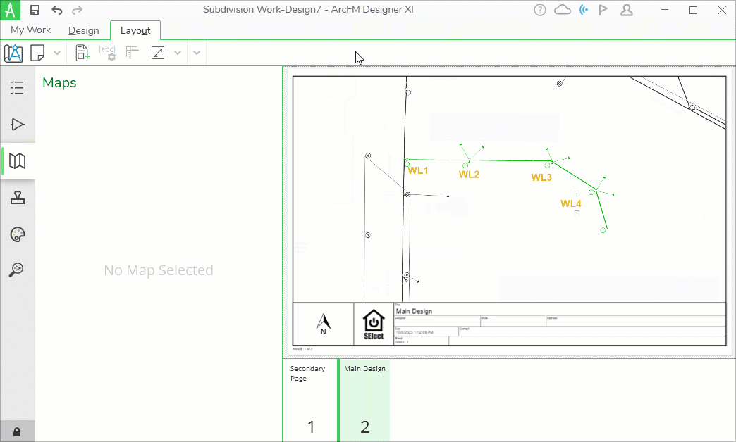
Click the Layout tab at the top of the screen. Notice the interface says “No Pages.”
-
Click the Add Element
 tool. This tool allows you to add Page Templates, Page Elements,
or Blank Pages into your Layout.
tool. This tool allows you to add Page Templates, Page Elements,
or Blank Pages into your Layout. -
In the Add Element dialog, double-click a desired Page Template to add it to your layout. The names in the image are just examples, and your names differ.
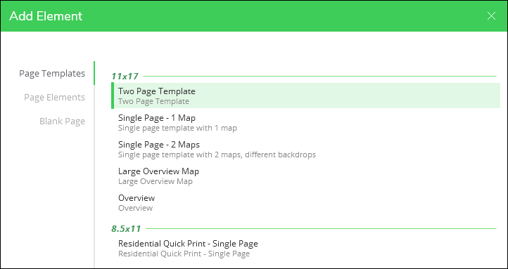 TIP: What is a Page Template? A Page Template is a pre-configured Layout complete with maps, page elements (graphics, North Arrow, company logo, etc.), text, and more. They are created by an administrator at your company (see Create Page Elements and Page Templates in the Designer XI Configuration Guide). Ideally, they satisfy the bulk of the Layout work, but you can always modify the look and feel of the Layout after you add the Page Template. If you find yourself adding the same element every time or making the same map modification every time, speak with your administrator to see if those changes could be made in the Page Template itself.
 -
Ideally, the Page Template satisfies most of your map work, but here are other modifications you can make:
-
Move/Resize the Map Frame: You have control over the position and size of the map on your page.
-
Click the map once. Notice it outlines in blue and there are blue “handles” on the corners and edges.
-
To move the entire map frame, click somewhere in the middle of the map, then drag it into position.
-
To resize the map, click and hold one of the blue handles, then drag it to resize.
TIP: Press and hold Ctrl while moving a handle to resize the map in a mirrored manner. Press and hold Shift while moving a handle to keep the current proportions of the map frame.
-
-
Change the Zoom/Extent of the Map within the Frame: This is not moving the map around the page. Instead, it is changing the zoom and location of the map within the frame.
-
Click the map once. Notice it outlines in blue and there are blue “handles” on the corners and edges.
-
On the Layout tab toolbar, click the Adjust Map Extent
 tool. Notice the map outlines in orange.TIP: Or, once the map is outlined in blue, press spacebar (do not hold it down). This also activates the Adjust Map Extent tool.
 -
Click and drag to pan the map.
-
Use your mouse wheel to zoom in or out on the map.
TIP: Press and hold Ctrl while scrolling the mouse wheel to make finer adjustments. This is seen at the end of the animated demonstration below, where the user is getting the map just right within the frame.
-
-
Modify the Design Style: This changes the look and feel of the design components, Reference layers, and Backdrop.
-
If necessary, double-click the map. Notice the application enters full screen mode, and the map outlines in orange as a sign the map is activated.
-
Click the Maps pane (if necessary).
-
All of the configurations on the Maps pane are available to you while working on the Layout tab. For more information, see the topic Maps Pane > Design and Design Style.
-
-
Label Design Components: Labeling is a great way to share information about design components. For more information, see the topic Layout Tab Labeling.
-
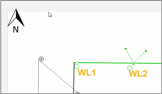
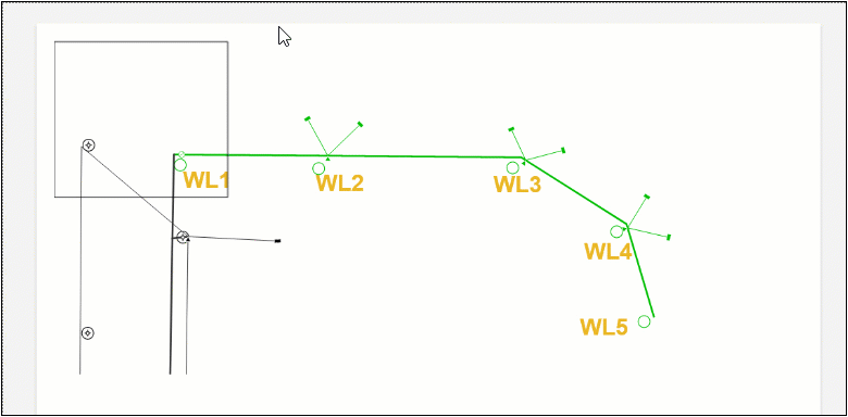
Hide Unnecessary Features: If there are features in the map that are not needed for the design and are cluttering the white space, you can hide them.
-
If necessary, double-click the map. Notice the application enters full screen mode, and the map outlines in orange as a sign the map is activated.
-
Use either the Select tool or Select by Rectangle tool to select features you want to hide.
-
Right-click, then choose Hide.
-
-
Clip the Map: This brings more focus to your design by clipping away the areas around your design components. You can adjust the opacity of the clipped features to a desired level.
-
If necessary, double-click the map. Notice the application enters full screen mode, and the map outlines in orange as a sign the map is activated.
-
Click the Map Clipper
 tool.
tool. -
Bring your cursor into the map.
-
Click to sketch the extent of the clip box. Each click places a vertex (or bend) in the clip shape.
-
Double-click or press Enter to finish.
-
Notice only the area within your clip box is visible.
-
Optionally, slide the Map Clipper Opacity bar to provide more or less focus on the design.
-
-
Add More Pages: You can have as many pages as required. When you ultimately generate the printable PDF, all pages are grouped into a single PDF.
-
To add a new page, you can either start back at the beginning with the Add Element
tool, or at the bottom of the interface, you can right-click
an existing page and choose Copy.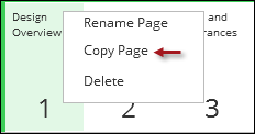
-
Still at the bottom of the interface, you can right-click an existing page to Rename it or Delete it.
-
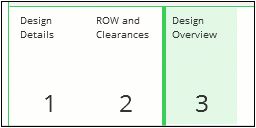
Finally, to re-order the pages, click and drag the pages into a desired order.
-
-
Work with Page Elements
Printable maps typically have many supportive elements such as a North Arrow, outline frames, and more. Ideally, the Page Template is designed to already include necessary elements, but you have the ability to add or modify elements on your Layout.
-
Ensure you are on the Layout tab at the top of the screen.
-
Click the Add Element
tool. This tool allows you to add Page Templates, Page Elements,
or Blank Pages into your Layout. -
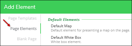
On the left-hand side of the dialog, click Page Elements. Notice there are many elements available (the names and options in the image below are just examples and yours will differ.)
3Sept2024, swapped Add Element image. Original included the Create/Edit/Delete toolbar that is only available to Admins. See GD-4176. CW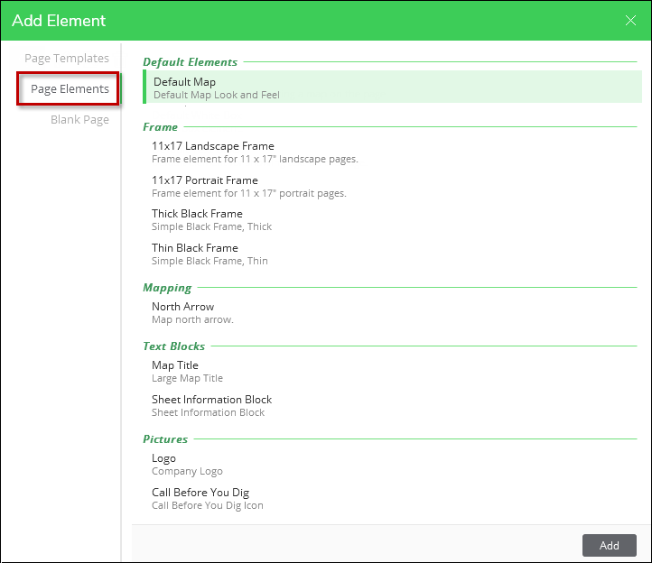
-
Double-click the desired element.
-
Depending on the element, you might have to re-position the element after placement. If the element is something like a page outline, and it was well-designed, it should “land” on the page in the correct position fully outlining the Layout. If the element is a picture, text box, or a smaller frame, it lands in the upper, left-hand corner of the Layout.
-
Re-position and re-size the element, as needed.
-
To re-position, click the element once. Notice it outlines in blue and includes blue “handles” on the edges and corners. Most elements also feature a rotation handle, but North Arrow elements do not.
-
Somewhere in the middle of the element, click and drag it into the desired position.
-
To re-size, click the element once. Notice it outlines in blue and includes blue “handles” on the edges and corners. Most elements also feature a rotation handle, but North Arrow elements do not.
-
Click and drag a handle into the desired position.
TIP:-
The default behavior of “Box” element types is to allow you to stretch the shape in any manner. There are two keyboard shortcuts, though, that change this behavior. Press and hold Ctrl while moving a handle to resize the map in a mirrored manner. Press and hold Shift while moving a handle to keep the current proportions of the map frame.
-
The default behavior of “Picture” element types is the opposite, where their proportions are locked when you try to resize it. This prevents pictures from being stretched and distorted. With Pictures, the Ctrl keyboard shortcut works the same where it resizes the Picture in a mirrored manner. Shift is the opposite, though. Press and hold Shift to “unlock” the proportions and resize to any shape.
-
-
-
Most elements feature a rotation handle. To rotate an element, hover the cursor over the handle and then click and drag to rotate as needed. Holding the Shift key as you rotate the element restricts rotation to 15–degree increments (0°, 15°, 30°, … , 315°, 330°)..
-
Finally, “Box” element types have extra color functions. After adding a box:
-
Click the Box element once.
-
Notice new tools appear along the Layout toolbar. These are present only when a Box (or Text Block) is clicked once and appears with the blue handles.
-
Use the Background, Border Thickness, and Border Color tools to change the look and feel of the Box.
TIP: Check the opacity of the color if you are not seeing it change on the Layout.
-
Work with Existing Text
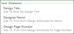
Printable maps typically have supportive text blocks to include things like design name, design address, work location name, designer name, page number, and more. Ideally, the Page Template is configured to already include necessary text that pulls information straight from the design.
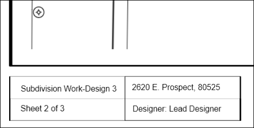
But, you can add and modify the text.
Again, the best approach is to have the Page Template already configured for text, and the text should be set to grab known attributes from the design. Your administrator can help with the Page Template design (see the Configuration Guide topic Create Page Elements and Page Templates). But, the steps below help you when you need to modify existing text.
Move Existing Text
-
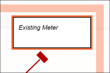
Click the text block once. Notice it highlights in blue and includes “handles” on the edges and corners.
-
Somewhere in the middle of the text, click and hold, then drag into a desired position.
TIP: Dragging a blue handle changes the size and shape of the text frame, but it does not affect the size of the actual text. Keep reading below to learn more about modifying the text size.
Modify the Background, Frame, Padding, and Alignment in a Text Block
-
Click the text block once. Notice it highlights in blue and includes “handles” on the edges and corners.
-
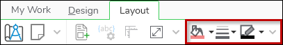
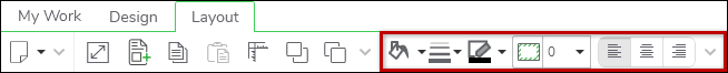
Further, notice new tools have appeared on the Layout tab toolbar. These are present when you have a text block activated.
-
Work with the tools to change the appearance of the text block. All the tools have tool tips. Further, they are described in the topic Layout Tab Toolbars.
-
When finished, click outside the text block to deactivate it.
Modify Text Font, Size, and Style
You can modify the text font, size, color, and style.
-
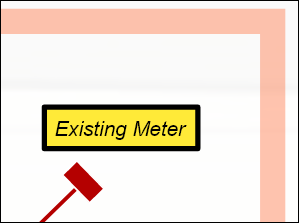
Double-click the text block. Notice it outlines in orange as a sign the text block is activated.
TIP: If the text block is pulling an attribute from the design itself, it displays the field that contains the attribute. Once you click outside the text block, it returns to showing the attribute instead of the field name.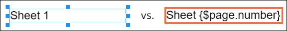
-
Further, notice new tools have appeared on the Layout tab toolbar. These are present when you have a text block activated.

-
Work with the tools to change the appearance of the text itself. All the tools have tool tips. Further, they are described in the topic Layout Tab Toolbars.
-
When finished, click outside the text block to deactivate it.
Add New Text, Free-Type
You can type information directly into text boxes on your layout.
When you want to add new, free-type text to your layout, ask yourself the following questions:
-
Do you want the text on the layout page and not anchored to the map? In other words, if you pan or zoom the map, the text does not change position or size; it is independent of the map. If the answer is yes, then use the Add Element
 tool described below.
 -
Do you want the text within the map and “anchored” to the map? In other words, if you pan or zoom the map, the text pans and zooms with the map. If the answer is yes, then use the Place and Edit Notes
 tool described below.
Add Text Element (Not Anchored to the Map)
-
Ensure the map is not activated (the map has a thick, orange outline if it is activated).
-
On the Layout toolbar, click the Add Element
tool. -
In the Add Element dialog, click Page Elements.
-
Each company organizes their elements differently, but usually there is a section of text elements. The following image is just an example.
-
Click your desired text element once, then click Add. Or, double-click your desired element.
-
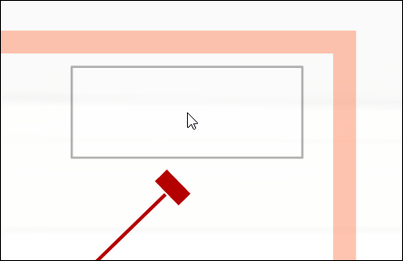
The text element appears in the middle of your layout by default.
-
Move and resize the text block as needed.
TIP: Use the Position Element tool for fine-tuned placement.
Add Notes (Anchored to the Map)
-
If necessary, double-click the map. Notice the application enters full screen mode, and the map outlines in orange as a sign the map is activated.
-
On the Layout toolbar, click the Place and Edit Notes
tool (this tool is visible only when the map is activated). -
Bring your cursor into the map. Notice a placeholder notes box is present.
-
Click once to place the box. Don’t worry, you are able to move and reposition it.
-
Still using the Place and Edit Notes
tool, double-click the notes box. Notice it outlines in orange
as a sign the box is activated. -
Type your text. Use the tools on the Layout toolbar to change font, size, and style (these tools are visible when the notes box is activated with the orange outline).
-
When you are finished working with the actual text, click outside the notes box once. Notice the box outlines in blue and includes blue “handles” on the edges and corners.
-
Use the blue handles to resize the box.
-
Click and drag the box into your desired position.
-
Use the tools on the Layout toolbar to change the appearance of the notes box itself, including background, frame, padding, and text alignment (these tools are visible when the notes box is clicked once and appears with the blue handles).
-
Click outside the notes box when finished.
Add New Text, Bring in from Design Attributes
Instead of personally typing text, you can bring in attributes from your design. This is helpful if you want to include such things as:
-
Create or print dates
-
Design name
-
Work request information including customer, description, address, and notes
-
Your name
-
Page number including current and total
Instead of typing that kind of information, make the application grab it directly from the design attributes.
To include design attributes within text boxes, follow these steps:
-
Click the Add Element
tool. -
In the Add Element dialog, click Page Elements.
-
Find a Text Element to add to the layout. Companies name and organize text elements differently, but there is usually an option to add a text box that is not pre-populated. This image is just an example:
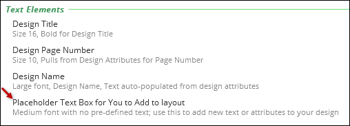
-
Click your Text Element once, then click Add.
-
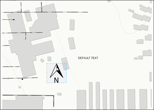
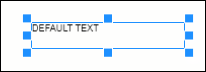
Notice your Map Element appears in the middle of your page. It states “DEFAULT TEXT” for now.
You will now work with the Text Element data source, size, color, and font. First, you establish the source.
-
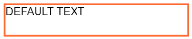
Double-click the Text Element, and notice it becomes active (outlines in orange).
-
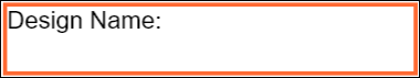
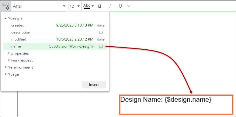
At this point, you can type in the box. In this example, we are going to bring in the design name from the design attributes. But, perhaps you want a little bit of introductory text such as “Design Name:” You can type that in directly within the box.
-
On the Layout tab toolbar, click the Insert Auto-Text
 tool (this tool is only visible when you have activated a text
box).
tool (this tool is only visible when you have activated a text
box). -
A drop-down appears showing you all the possible attributes you can add to your Text Element.
-
Expand the categories until you find the desired attribute. Again, in this example, we are finding the Design Name.
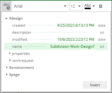
-
Click Insert. Notice the application added the attribute to the Text Element.
 TIP: Are you working with a date or time field? You can add Format Specifiers to change the date or time format. For example:
-
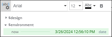
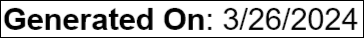
Let’s say you are bringing in the current date and time to act as a “Generated On” text element. Notice how the format is saved in the Attributes.
-
Thus, if you left it as the variable alone...
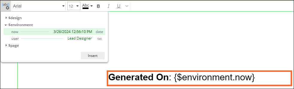
...the final print looks exactly like the attribute:

-
Or, you can add a Format Specifier at the end of the variable to change the final look. After the variable, type a colon followed by the Format Specifier, which is a single letter. Case does matter. Here are some common examples and how they transform the field (the “now” part is just continuing the example above; your variable depends on what attribute you are using):
-
{now:d} generates 7/7/2023
-
{now:g} generates 7/7/2023 9:38 AM
-
{now:m} generates July 7
-
{now:t} generates 9:38 AM
-
{now:y} generates July 2023
-
{now:D} generates Thursday, July 7, 2023
-
-
Those are the most common, but there are more described in the Microsoft help article Standard Date and Time Format Strings.
-
So, if you changed the variable to {$environment.now:d} (notice the :d at the end), it would display as:
-
-
With the Text Element still active, you can work with the font, size, and style tools found on the Layout tab toolbar.
-
When finished, click outside the Text Element. Notice it is outlined in blue with “handles” on the edges and corners.
-
Click and drag the Text Element into your desired position. Use the blue handles to resize the Text Element.
Add Images
You can easily add images with a “drag and drop.” The application supports the following image types:
-
.svg
-
.ico
-
.png
-
.gif (non-animated)
-
.jfif
-
.webp
-
.jpg
-
.jpeg
-
.bmp
-
.wbmp
-
.dng
To add an image, follow these steps:
-
Ensure you are on the Layout tab.
-
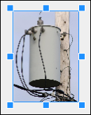
Have your image file ready and available. For example, have the Windows folder that contains the image open on your screen.
-
In the Windows folder, click and hold the image, then drag it onto your layout.
-
Use the blue handles to resize the image (if the handles are not present, click the image once to make them appear).
 TIP: Be default, images maintain their aspect ratio when you are resizing them so that they do not get distorted. You can press Shift while resizing to unlock the aspect ratio. Further, you can press Ctrl while resizing to scale the image in a mirrored fashion.
 -
To move the image, click and hold within the image, then drag it into position.
TIP: On the Layout toolbar, use the Move Forward and Move Backward tools to control which images or text are on top and bottom.
Good to Know
Images added in the above manner are only saved locally. So, if you send this design to a co-worker, the image is not sent.
If you need to send the image along with the design to a co-worker, use a Picture Page Element. These are saved to the cloud and are accessible to the recipient of your design. However, they need to be pre-created by an administrator.
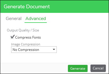
Generate Document
When everything looks good and meets your company’s standards, you can save a PDF of your Layout.
-
At the top of the interface, click the Generate Document
 tool. Notice a Generate Document dialog appears.
 -
Decide which pages to print to PDF.
-
On the Advanced tab, choose your compression options.
-
We recommend compressing the fonts. This can reduce the file size substantially.
-
For Image Compression, we recommend testing a few prints to view the balance between image clarity and file size.
-
-
Click Generate.
-
Notice a progress dialog appears displaying the status of the job.
-
When the application is finished, your PDF opens automatically within your default PDF viewer.
-
If the print looks good, proceed with your company’s workflow and next steps for the PDF.
IMPORTANT:-
By default, the application saves your PDF in C:\Users\username\Documents\Designer.
-
Further, by default it names the PDF “DesignDocument.”
-
It overwrites any previously-created “DesignDocument” the next time you generate another document.
-
Thus, you should perform a “Save As” within your PDF viewer if you do not want the PDF overwritten.
-
Your company can create Custom Print Tools to help manage PDFs.
-
Further, your company can create Print Workflows to enhance the print process.
-