Layout Tab Toolbar
The Layout tab toolbar changes to react to whether the map is unselected, clicked once (blue outline), or double-clicked (orange outline). It also reacts if you have a layout element (such as text) selected.
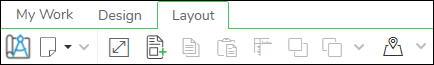
Toolbar with Unselected Map or Unselected Element
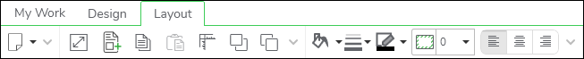
Toolbar with Single-Clicked Map (Blue Outline)

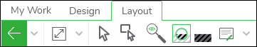
Toolbar with a Double-Clicked Map (Orange Outline)
Toolbar with a Single-Click Text Element (Blue Outline around Element)
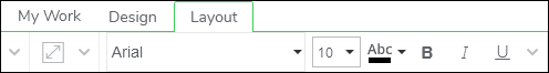
Toolbar with a Double-Clicked Text Element (Orange Outline around Element)
Tool Descriptions
|
Tool |
Use |
|---|---|
|
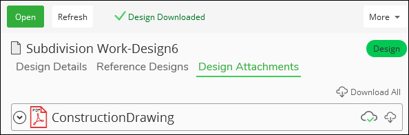
Attach Construction Drawing |
This prints your map (or if present, multiple map pages) to a PDF, then attaches the PDF to your design within the Designer Storage Service. Further, the same PDF can be downloaded and viewed locally on the My Work tab. See the topic Design Attachments for more information.
|
|
Generate Document |
This creates a PDF of your current Layout. If you have multiple pages in your Layout, it creates a single PDF that contains all pages. The generated PDFs are saved in C:\Users\username\Documents\Designer. TIP: What is the difference between Generate Document and Attach
Construction Drawing? The main difference is Generate Document creates
a PDF only on your local machine. Only you can access it from your
machine. Attach Construction Drawing creates a PDF that is saved in
the Designer Storage Service, which means is can be accessed by other
applications such as ArcFM Mobile XI as part of a larger workflow.
|
|
View Full
Extent |
This zooms the Layout tab to show the entire, current page. It does not affect the zoom of the map on the Layout, just the Layout itself. It is helpful when you’ve become “lost” on your canvas and want to reset the display back to the page. |
|
Add Element |
This allows you to add items to your Layout. This includes new Page Templates (pre-saved Layouts), Page Elements (items such as text boxes, outlines, north arrows, etc.), or a Blank Page. When working with a new Layout that has nothing in it, this is the first button you click to get started. |
|
Copy Element |
This copies an element to your clipboard. Click the element (such as a text box or picture), then click Copy Element (or press Ctrl+C). This is helpful if you want to copy and paste an element on your current page, or you can copy and paste the element on a different page in your Layout. |
|
Paste Element |
This pastes an element from your clipboard and onto your Layout. After copying an element, click to paste (or press Ctrl+V). This is helpful if you want to copy and paste an element on your current page, or you can copy and paste the element on a different page in your Layout. TIP: Ctrl + V pastes the element in the middle of your page. Ctrl + Shift + V pastes the element in the same
location as the copied element. If page sizes are different or
if page orientations are different, we recommend using Ctrl + V to
paste it in the middle, then move it into your desired position. With
Ctrl + Shift + V, the pasted element might appear off the page, in
other words, in the gray, working area around the page, and it might
be hard to find. At that point, you can still move it into your desired
position.
|
|
Position Element |
This tool opens up a position dialog which allows you to precisely place and resize map elements on your Layout. For the most part, you can likely drag and drop elements using your mouse, but for fine-tuning the position and size, this dialog is helpful. |
|
Move Forward
and Move Backward |
These control the vertical placement of elements. In other words, they control how elements are stacked. Move elements back to appear behind or lower. Move elements forward to appear in front or higher. |
|
Select |
Click features to highlight them individually. Details about the selected feature appear in the Component Information pane. |
|
Select by Rectangle |
Draw a rectangle around multiple items in the map to highlight them as a group. |
|
Adjust
Map Extent |
This tool allows you to change the map extent on your layout (the map extent refers to the zoom and location of the map itself). In other words, if you need to pan or zoom the design within the map frame, this is the tool for you.
After you click the Adjust Map Extent |
|
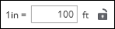
Map Scale |
This drop-down contains a list of predetermined scales for the map extent (how zoomed in or out the map is). You can also type in a number, even one that is not in the drop-down by default, then press Enter. The units of measure are configured in Solution Center.
IMPORTANT: This tool is visible only after you click
the Adjust Map Extent
 tool. tool.If your company has opted to display map units, the drop-down no longer appears. Instead, you see the ratio of map units.
This configuration choice occurs in Electric Options or Gas Options. |
|
Lock Map Scale |
This locks the map scale and prevents you from zooming in or out with the mouse wheel. This is helpful when you’ve got the map extent right where you want it, and you do not want to accidentally change it. You can still change the scale using the Map Scale drop-down. You can still pan the map (unless Lock Map Position is also on, which prevents you from panning the map). IMPORTANT: This tool is visible only after you click the Adjust
Map Extent
tool. |
|
Discover |
Click to reveal previously-hidden components. Once revealed, click hidden components to make them visible again. Or, press and hold the Spacebar and hover over hidden components to reveal them en masse (this is called Brush Mode). |
|
Map Clipper |
This crops the map to a desired size and shape. It is helpful to “hide the clutter” of surrounding, unrelated features. |
|
Clear Map Clipper |
If you have previously used the Map Clipper to crop the size and shape of the map, this returns the map to its full extent. |
|
Place and
Edit Notes |
This allows you to place a text box within your design. The key here, is that this text box is anchored to your design. In other words, if you pan the map, the text box moves too. If you zoom in or our on the map, the text box grows or shrinks, respectively. This is different than a Text Element added using the Add Element tool. Those Text Elements do not move, grow, or shrink. They are independently of the map extent or scale. |
|
Exit Editing |
When you double-click the map, you enter into full-screen mode, which is helpful for placing labels. Once you are ready to leave the full-screen mode, click Exit Editing, or use the hotkey Ctrl+X. IMPORTANT: You cannot click in the “white space”
to leave full-screen mode. You must click the Exit Editing button.
|
|
Text Element
Options |
Click a Text Element (whether added using the Add Element tool or the Place and Edit Notes tool) once to highlight the text box in blue. Then, these options appear. These control the background color of the text box, the thickness of the border, and the color of the border. |
|
Text Padding |
Click once on a Text Element (whether added using the Add Element tool or the Place and Edit Notes tool) to outline the text box in blue. Then, this option appears. This controls the padding or buffer between the text and the border. If you want more space between the text and the border, increase this value. |
|
Text Alignment
Options |
Click once on a Text Element (whether added using the Add Element tool or the Place and Edit Notes tool) to outline the text box in blue. Then, this option appears. This controls whether the text is left, center, or right-aligned. |
|
Text Font
and Style Options |
Double-click a Text Element (whether added using the Add Element tool or the Place and Edit Notes tool) to outline the text box in orange. Then, these options appear. They control the font and style of the text. |